As some of you might remember from this post, I've been working on the jacket image for my new book Abigail Spells. After some consideration, the designer had the good idea to make the cover more poster-like. She sent me this layout idea, incorporating my previous sketches into a new design:
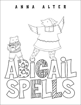
I like the simple, pared down design... so I made another sketch, blowing up the characters a little and hand lettering the title:

Once we agreed that this design worked for both of us, I went about tracing the image once more to transfer it onto my paper. I separated the image of the characters and the type, so that they can be used separately if need be:
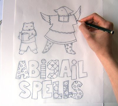
Next I flipped over the tracing and penciled in the underside of the drawing:
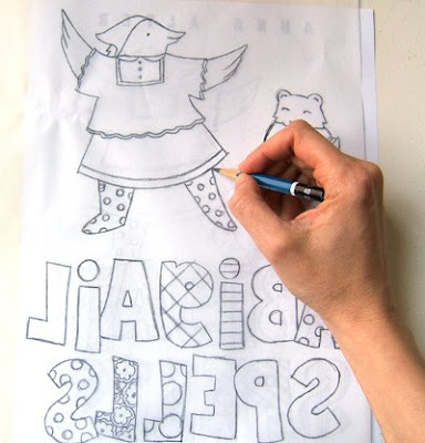
Then I flipped it over again and traced the image a third time, onto my paper. I started laying down the under painting:
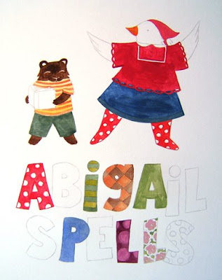
As I slowly layered color ideas, I started to get a sense for the palette and patterns I wanted to use:
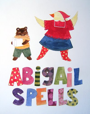
Again, slowly layering color in place:
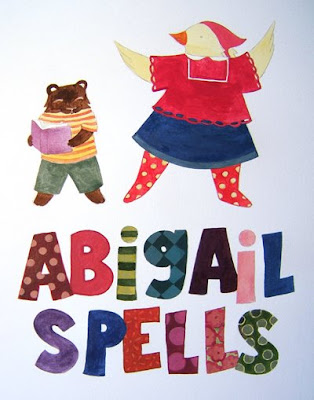
Stay tuned for the final steps next week!

8 comments:
Just curious, but is there a reason you don't use a lightbox when transferring your image from one paper to another?
Hi there-
The paper I paint on is very thick, I don't believe I'd be able to see through it on a light box. I know some people use projectors to transfer their sketches, but I don't mind doing it this way- it gives me time to think and refine the image as I redraw it.
Hi Anna-
I love seeing your process. Your probably my favorite BRG poster becuase of this! Very nice palatte-what type of paint do you use? Do you ever gesso your paper beforehand?
Beautiful work.
Thanks! I use acrylic. I don't usually gesso first. I like to use an absorbent paper that really takes the paint, so that I have some transparent washes, and some opaque ones to contrast.
I love these process pieces of yours. Keep them coming.
I use my wide format printer to reproduce my pencil sketches in sepia, on watercolour paper now so I almost have forgotten the old light box, or tracing way of doing things. I love how printing out the first sketch allows for not losing the first pencil, which is almost always the best and most spontanious.
I honestly don't like layout, I loved your first one, with the friends drawing on the side walk. This one is more staged.
Anna, I wanted to add that this is just me thinking your first instinct was best. Not a critique of your art. I just believe your first instincts were the best. A designer is... a designer. I just got a much more lovely/fun feeling from your initial illustration roughs.
Beautiful!!! I love it!!!
Post a Comment